When the configuration of the DMARC analyzer is complete, Trustifi will start collecting DMARC reports from all email recipients of your domain and display them in this dashboard:
This article will break down the different sections of this dashboard and help understand the data they display.
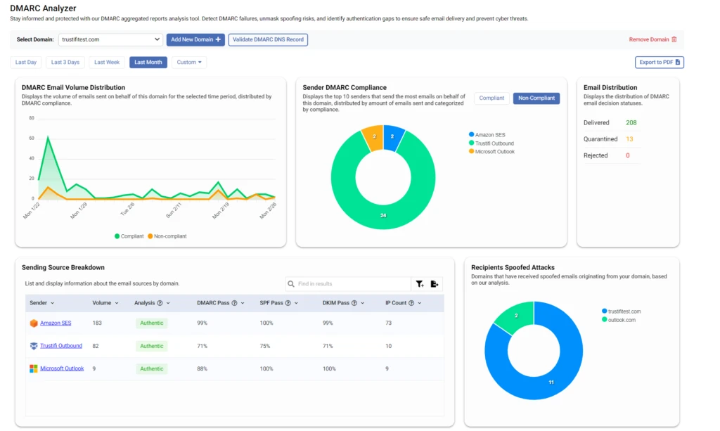
DMARC Email Volume Distribution
This chart displays and visualizes the volume of emails sent from your domain, distributed by DMARC compliance.
The green line represents emails that comply with your DMARC policy, while the orange line represents emails that do not comply with your DMARC policy.
This type of view can help identify trends or changes in overall DMARC compliance in your domain. For example, if you notice an increase in non-compliant emails from a certain date it’s possible that someone has started spoofing your domain, or that a DNS change caused a misconfiguration.
You can also hover your mouse over each data point to show the specific number of compliant and non-compliant emails for that day/week.
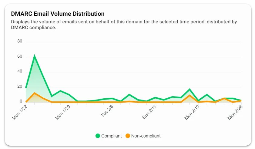
Sender DMARC Compliance
This donut chart displays the top 10 senders (by volume) that send the most emails on behalf of your domain. This chart has 2 views you can switch between – “Compliant” and “Non-Compliant”.
“Senders” in this chart could be any entity or service that sends emails on behalf of your organization.
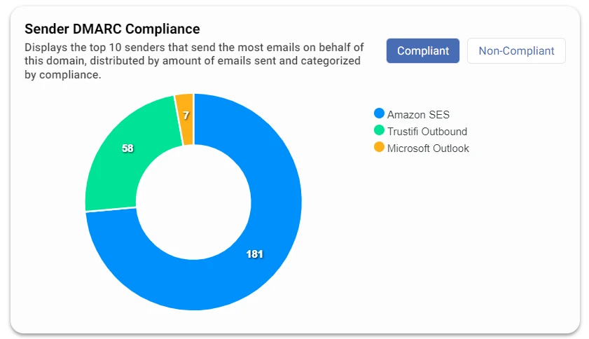
Email Distribution
This section shows the overall distribution of final DMARC status for emails sent from your domain for the selected time period.
Emails that pass authentication standards like SPF and DKIM should generally always be delivered, however if one or both of these fail – your DMARC policy will determine if this violation should be ignored, or if the email should be quarantined or rejected.
In a healthy email environment, you should not be seeing many emails being rejected or quarantined. If you see many emails being rejected or quarantined, this could indicate a spoofing attack is being done on your domain, or that a recent DNS change has caused a misconfiguration with SPF or DKIM.
Sending Source Breakdown
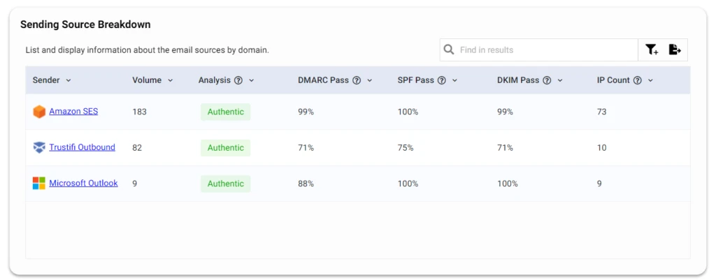
This section lists each entity/source that sends emails on behalf of your domain, and displays the following information for each source:
- Volume: the overall number of emails sent from this source on behalf of your domain over the selected time period.
- DMARC, SPF, and DKIM pass rates: the percentage of emails for which DMARC, SPF, and DKIM have passed, out of the total number of emails sent from this source on behalf of your domain.
- Analysis: Trustifi determines this status based on a number of metrics, including the authentication standards pass rates, and estimates if this source is legitimate (“Authentic”), potentially spoofed, or something else like an auto-forward or redirect service.
- IP count: the total numbers of IPs that were observed to be sending emails from this source on behalf of your domain.
Records for each sending source
Clicking on each individual sending source will display a list of the metadata reported for each email that was sent from this source over the selected time period.
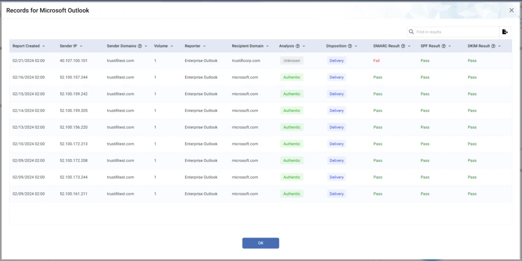
Each record displays a variety of data points that can help determine if the email was legitimately sent from your domain. In addition to the DMARC, SPF, and DKIM result of each email you can also view the delivery disposition for the email – which shows if the email should be delivered, quarantined, or rejected based on it’s authentication standards.
The record lists for each sending source can help IT personnel understand if there are any DNS misconfigurations related to any of their MTAs or services, as well as keep an eye on suspicious activity that could indicate a spoofing attack.
Recipients of Spoofed Attacks
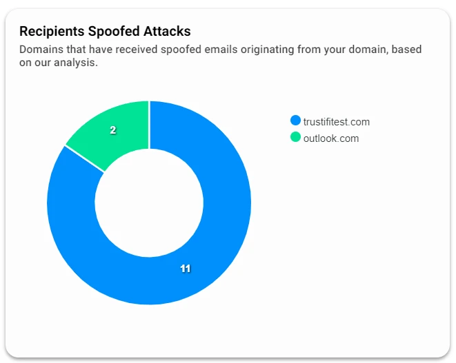
This graph displays domains that reported receiving emails which appear to be spoofing your domain, based on the DMARC status and analysis of SPF and DKIM.
Ideally this graph should be empty and display no data, but if you suspect that anyone is spoofing your domain based on the information in this dashboard, this graph will help visualize who if on the receiving end of these spoofed emails.